
CASE STUDY
PiddeG
Restaurant Branding
Client Challenge
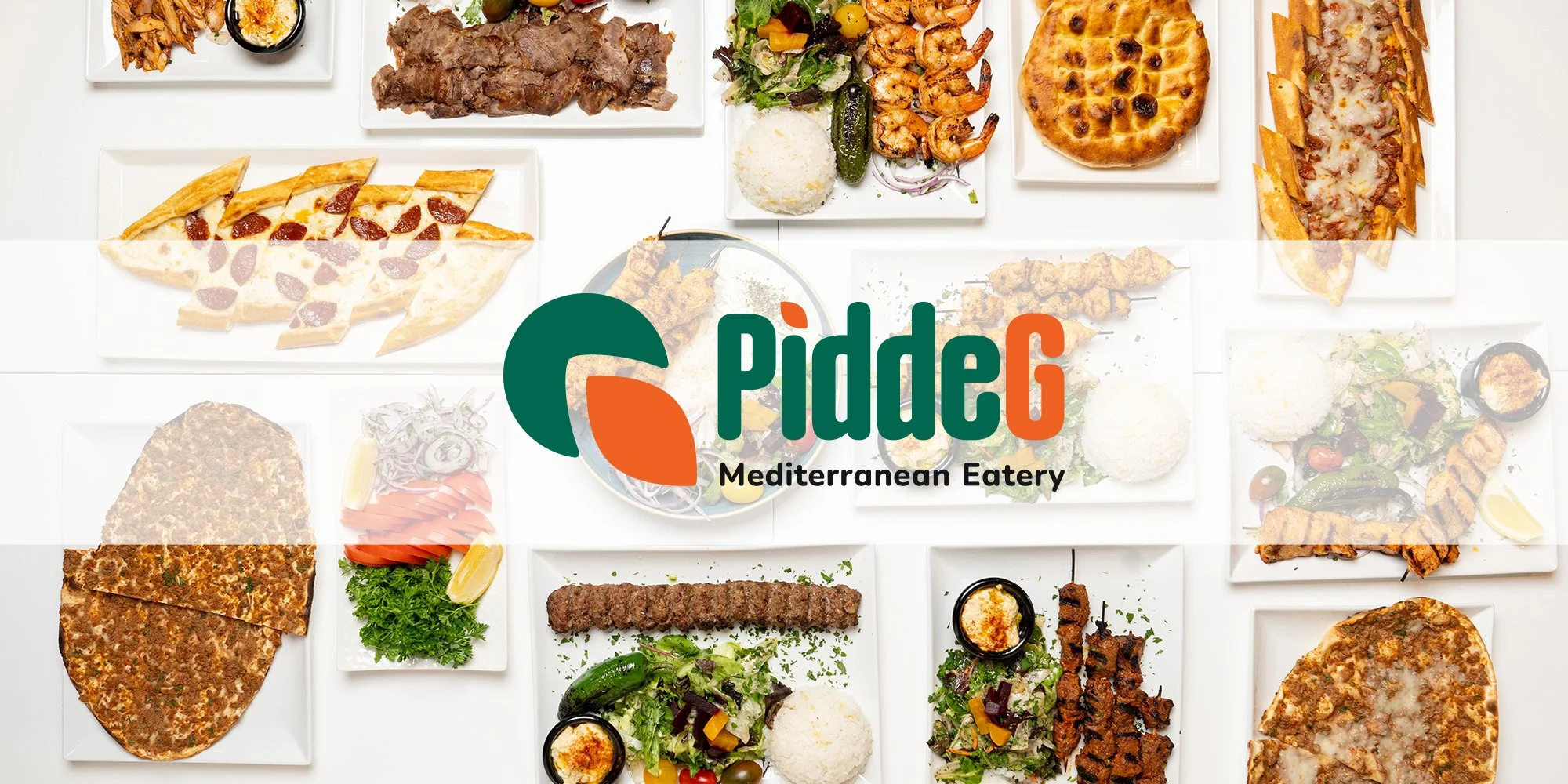
A new restaurant serving Turkish/Mediterranean cuisine — with dishes like Pide and Lahmacun unfamiliar to most Americans — needed a brand identity that stood apart. The owners wanted to avoid the cliché of Turkish grills that often rely on red color palettes and kebab imagery. Their restaurant had a modern, Bauhaus-inspired interior with bold emerald green, and they wanted a brand identity that felt just as fresh and contemporary.
My Solution
I developed a brand identity that blended cultural authenticity with modern design sensibility:
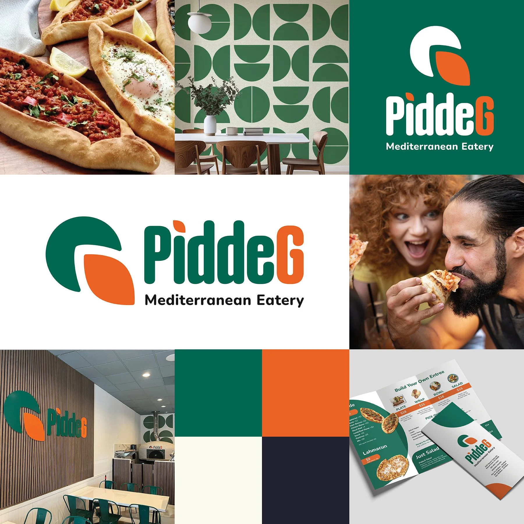
Color palette – Emerald green carried over from the interior design, paired with a rich orange for warmth and contrast.
Logo design – A modern, clean mark inspired by the unique shapes of their signature dishes: the boat-shaped Pide and the rounded Lahmacun.
Typography & brand system – Minimal, modern typefaces to align with the Bauhaus aesthetic of the space, ensuring cohesion between environment and brand.
The result is a striking, modern identity that still feels authentic and welcoming.
The Outcome
The branding set the restaurant apart from competitors and aligned seamlessly with its interior design. Guests encounter a fresh, contemporary take on Turkish dining, one that honors tradition while appealing to a new audience. The unique logo and bold color palette give the restaurant a recognizable presence, both in signage and marketing.
“We had an incredible experience working with Julia on our logo and digital menu design. She truly understood our vision from the start and translated it into designs that perfectly reflect our brand. Her creativity, attention to detail, and professionalism made the entire process smooth and enjoyable.”
—Onur Yildiz, Owner of PiddeG