
CASE STUDY
Be Vital
Branding and Website
Client Challenge
When Dr. Matt Longwill transitioned from chiropractor to energy healer, he needed a brand that captured both the scientific and spiritual sides of his new practice. His initial vision—a daffodil growing from a mosaic heart—symbolized growth from brokenness, but it felt too intricate to function well as a logo. The goal was to distill that same emotional meaning into something elegant, memorable, and scalable.
My Solution
I developed a brand identity that communicates harmony, compassion, and renewal through clean design and meaningful symbolism:

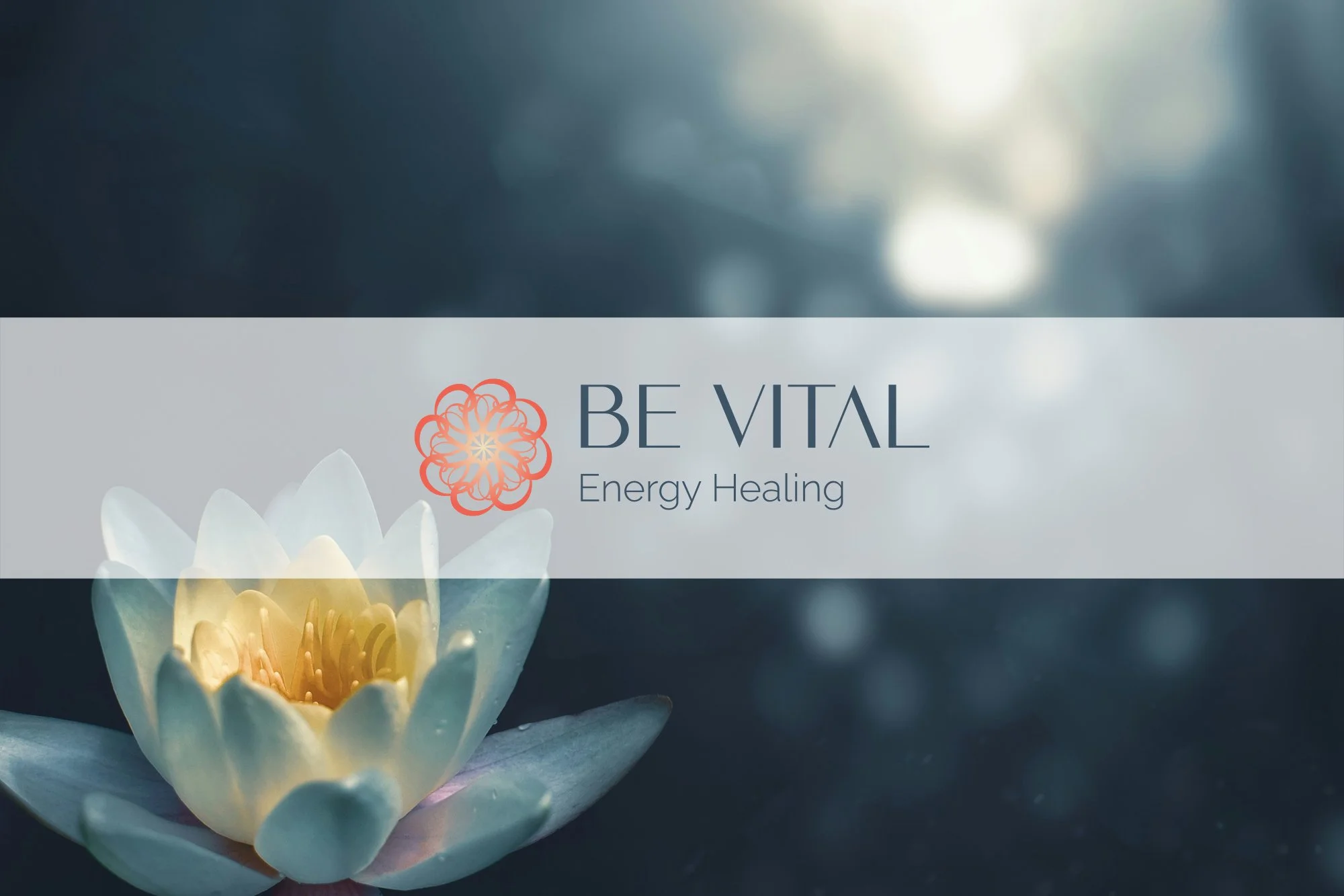
Logo and typography – A custom mandala combining two core symbols: the Fibonacci curl for balance, harmony, and growth, and a heart for compassion and healing. Paired with modern, approachable typefaces and generous white space, the overall design feels calm, grounded, and professional—perfectly mirroring Dr. Matt’s energy healing philosophy.

Color palette – A soothing combination of soft, sunrise-inspired hues of peach and pink-orange paired with a calming dark grey-blue. The warmth and lightness of the peach tones balance beautifully with the grounding blue, creating a sense of peace, trust, and clarity.
Website design – A thoughtfully structured site that balances education and action, guiding visitors from curiosity to understanding to booking a session. The design uses clear hierarchy, simple navigation, and open layouts to mirror the peaceful, grounded nature of Dr. Matt’s practice.
The result is a cohesive, heart-centered identity and website that feel both professional and deeply personal—helping Dr. Matt educate, inspire, and connect with clients on their healing journey.
The Outcome
Dr. Matt’s new brand and website now reflect the calm, heart-centered experience he offers his clients. His online presence feels aligned, professional, and welcoming—helping him connect authentically with new clients while sharing his unique approach to healing.